react-datepicker 적용하기(+ 커스텀)
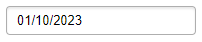
달력 구현에 어떤 라이브러리를 쓸까 고민하다가 가장 무난하고 많이 쓰이는 react-datepicker를 적용해보았다.
React Datepicker 설치, 적용하기
라이브러리 설치
yarn add react-datepicker date-fns
yarn add -D @types/react-datepicker

// or

npm install react-datepicker date-fns
npm install --save-dev @types/react-datepicker
react-datepicker를 설치해준다.
헤더 부분을 커스텀할 때 date-fns를 사용하기 때문에 같이 설치해주었다.
typescript를 사용하는 경우 devDependencies에 @types/react-datepicker를 같이 설치해주어야 사용할 수 있다.
react-datepicker 적용
import DatePicker from 'react-datepicker';
import 'react-datepicker/dist/react-datepicker.css';

const Calendar = () => {
  const [selectedDate, setSelectedDate] = useState<Date | null>(new Date());

  return (
    <DatePicker
      dateFormat='yyyy.MM.dd' // 날짜 형태
      shouldCloseOnSelect // 날짜를 선택하면 datepicker가 자동으로 닫힘
      minDate={new Date('2000-01-01')} // minDate 이전 날짜 선택 불가
      maxDate={new Date()} // maxDate 이후 날짜 선택 불가
      selected={selectedDate}
      onChange={(date) => setSelectedDate(date)}
    />
  );
};

export default Calendar;
기본적으로는 위와 같이 사용할 수 있다. selected와 onChange 속성은 꼭 지정해주어야 하고, 나머지 속성들은 원하는대로 추가해주면 된다.
위에서 사용한 것 외에도 굉장히 많은 속성이 존재한다.
react-datepicker를 사용한 다양한 예시가 보고 싶다면 아래 사이트를 참고해보는 것도 좋다.
React Datepicker crafted by HackerOne
reactdatepicker.com
원하는대로 커스텀하기
input 커스텀하기
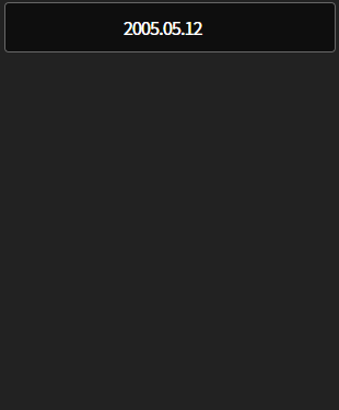
input 부분을 커스텀하려면 DatePicker에 className을 지정해주면 된다.
components/Calendar/index.tsx
<DatePicker
  // ...
  className={styles.datePicker}
  // ...
/>
components/Calendar/calendar.module.scss
@use '/src/styles/constants/colors';

.datePicker {
  display: flex;
  align-items: center;
  border: 1px solid colors.$GRAY6;
  border-radius: 4px;
  background-color: colors.$BG_COLOR;
  box-sizing: border-box;
  width: 100%;
  height: 46px;
  color: colors.$WHITE;
  text-align: center;
  padding-right: 14px;

  &:focus {
    border: 2px solid colors.$ORANGE;
  }
}
헤더 커스텀하기
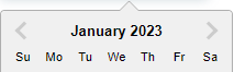
커스텀 헤더는 이 예시를 참고했다.
헤더를 커스텀할 때는 renderCustomHeader를 이용한다.
이는 기본적으로 연도를 바꿀 수 있는 changeYear 함수, 이전 달로 이동하는 decreaseMonth, 다음 달로 이동하는 increaseMonth와 date, prevMonthButtonDisabled, nextMonthButtonDisabled 등을 제공한다.
components/Calendar/index.tsx
const YEARS = Array.from({ length: getYear(new Date()) + 1 - 2000 }, (_, i) => getYear(new Date()) - i);
const MONTHS = [
  'January',
  'February',
  'March',
  'April',
  'May',
  'June',
  'July',
  'August',
  'September',
  'October',
  'November',
  'December',
];
년, 월을 직접 map을 돌릴 것이기 때문에 따로 배열을 만들어주었다.
YEARS는 2000년부터 2023년까지를 Array.from을 이용해서 만들어주었다.
components/Calendar/index.tsx
const Calendar = ({ selectedDate, setSelectedDate }: Props) => {
  return (
    <div className={styles.datePickerWrapper}>
      <DatePicker
        // 요일이 Su Mo Tu가 아닌 S M T 형태로 나타냄
        formatWeekDay={(nameOfDay) => nameOfDay.substring(0, 1)}
        showYearDropdown
        scrollableYearDropdown
        yearDropdownItemNumber={100}
        renderCustomHeader={({
          date,
          changeYear,
          decreaseMonth,
          increaseMonth,
          prevMonthButtonDisabled,
          nextMonthButtonDisabled,
        }) => (
          <div className={styles.customHeaderContainer}>
            <div>
              <span className={styles.month}>{MONTHS[getMonth(date)]}</span>
              <select
                value={getYear(date)}
                className={styles.year}
                onChange={({ target: { value } }) => changeYear(+value)}
              >
                {YEARS.map((option) => (
                  <option key={option} value={option}>
                    {option}
                  </option>
                ))}
              </select>
            </div>
            <div>
              <button
                type='button'
                onClick={decreaseMonth}
                className={styles.monthButton}
                disabled={prevMonthButtonDisabled}
              >
                <LeftArrow fill='#ffffff' />
              </button>
              <button
                type='button'
                onClick={increaseMonth}
                className={styles.monthButton}
                disabled={nextMonthButtonDisabled}
              >
                <RightArrow fill='#ffffff' />
              </button>
            </div>
          </div>
        )}
      />
    </div>
  );
};
날짜, 년도 선택 드롭다운, 월 이동 버튼을 넣어주었다.
components/Calendar/calendar.module.scss
.customHeaderContainer {
  display: flex;
  justify-content: space-between;
  align-items: center;
  background-color: colors.$BG_COLOR;
  height: 100%;
  margin-top: 8px;
  padding: 0 12px 0 24px;

  .month {
    color: colors.$WHITE;
    font-size: 16px;
    font-weight: 500;
  }

  .year {
    background-color: colors.$BG_COLOR;
    color: colors.$WHITE;
    border: none;
    font-size: 16px;
    font-weight: 500;
    padding-right: 5px;
    cursor: pointer;
    font-family: 'Noto Sans KR', serif;
  }

  .monthButton {
    width: 34px;
    height: 34px;
    padding: 5px;
    border-radius: 50%;

    + .monthButton {
      margin-left: 24px;
    }

    &:hover {
      background-color: rgba(colors.$WHITE, 0.08);
    }

    &:disabled {
      cursor: default;
      background-color: colors.$BG_COLOR;

      svg {
        fill: #575757;
      }
    }
  }
}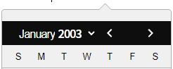
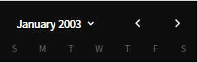
여기까지 적용해주면 아래와 같이 딱 헤더부분만 스타일이 적용된 것을 볼 수 있다. 헤더를 감싸고 있는 나머지 부분도 스타일링을 해주자.
styles/index.scss
전역 스타일을 선언해준 곳에서 직접 react-datepicker의 클래스 이름을 지정해서 스타일을 변경해주면 된다. (클래스 이름은 개발자 도구에서 직접 바꾸고 싶은 부분을 선택해 확인하자.)
body {
  // ...

  .react-datepicker {
    font-family: 'Noto Sans KR', serif;
    border: none;
    border-radius: 0;

    .react-datepicker__header {
      background-color: colors.$BG_COLOR;
      color: colors.$WHITE;
      border-bottom: none;
      border-radius: 0;

      .react-datepicker__day-names {
        display: flex;
        justify-content: center;
        align-items: center;
        height: 40px;

        .react-datepicker__day-name {
          color: #5b5b5b;
          width: 36px;
        }
      }
    }

    .react-datepicker__triangle {
      display: none;
    }
  }
}
날짜 커스텀하기
배경색 바꾸기
먼저 캘린더의 배경색 부분을 검정색으로 바꿔보자.
components/Calendar/index.tsx
<DatePicker
  // ...
  calendarClassName={styles.calenderWrapper}
  // ...
/>
calendarClassName에 클래스명을 지정해주면 된다.
components/Calendar/calendar.module.scss
.calenderWrapper {
  background-color: colors.$BG_COLOR;
}
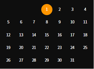
날짜 부분 바꾸기
components/Calendar/index.tsx
<DatePicker
  // ...
  dayClassName={(d) => (d.getDate() === selectedDate!.getDate() ? styles.selectedDay : styles.unselectedDay)}
  // ...
/>
dayClassName 속성을 이용한다. 여기에는 클래스명을 바로 전달할 수 없고 반드시 함수 형태로 전달해야 한다.
해당 날짜가 선택한 날짜와 같다면 selectedDay, 다르다면 unselectedDay라는 클래스 이름을 지정해주도록 했다.
components/Calendar/calendar.module.scss
.selectedDay,
.unselectedDay {
  color: colors.$WHITE;
  padding: 3px 1px 0 0;
  width: 36px;
  height: 36px;
}

.selectedDay {
  background-color: colors.$ORANGE;
  border-radius: 50%;

  &:hover {
    border-radius: 50%;
    background-color: #c27101;
  }
}

.unselectedDay {
  &:hover {
    border-radius: 50%;
    background-color: rgba(colors.$WHITE, 0.08);
  }
}
여기까지 하면 위와 같이 된다.
여기에서 이전 달, 다음 달에 해당하는 날짜는 표시되지 않도록 해보자.
styles/index.scss
body {
  // ...

  .react-datepicker {
    // ...

    .react-datepicker__day--outside-month {
      cursor: default;
      visibility: hidden;
    }
  }
}
전역 스타일을 지정해준 부분에서 react-datepicker__day--outside-month 클래스에 스타일을 바꿔주면 된다.
(display: none으로 설정하면 아예 사라져서 날짜 레이아웃이 깨지기 때문에 visibility: hidden을 해주었다.)
전체 코드
components/Calendar/index.tsx
import { Dispatch, SetStateAction } from 'react';
import DatePicker from 'react-datepicker';
import { getMonth, getYear } from 'date-fns';
import 'react-datepicker/dist/react-datepicker.css';

import { LeftArrow, RightArrow } from '../../assets/svgs';
import styles from './calendar.module.scss';

interface Props {
  selectedDate: Date | null;
  setSelectedDate: Dispatch<SetStateAction<Date | null>>;
}

const YEARS = Array.from({ length: getYear(new Date()) + 1 - 2000 }, (_, i) => getYear(new Date()) - i);
const MONTHS = [
  'January',
  'February',
  'March',
  'April',
  'May',
  'June',
  'July',
  'August',
  'September',
  'October',
  'November',
  'December',
];

const Calendar = ({ selectedDate, setSelectedDate }: Props) => {
  return (
    <div className={styles.datePickerWrapper}>
      <DatePicker
        dateFormat='yyyy.MM.dd'
        formatWeekDay={(nameOfDay) => nameOfDay.substring(0, 1)}
        showYearDropdown
        scrollableYearDropdown
        shouldCloseOnSelect
        yearDropdownItemNumber={100}
        minDate={new Date('2000-01-01')}
        maxDate={new Date()}
        selected={selectedDate}
        calendarClassName={styles.calenderWrapper}
        dayClassName={(d) => (d.getDate() === selectedDate!.getDate() ? styles.selectedDay : styles.unselectedDay)}
        onChange={(date) => setSelectedDate(date)}
        className={styles.datePicker}
        renderCustomHeader={({
          date,
          changeYear,
          decreaseMonth,
          increaseMonth,
          prevMonthButtonDisabled,
          nextMonthButtonDisabled,
        }) => (
          <div className={styles.customHeaderContainer}>
            <div>
              <span className={styles.month}>{MONTHS[getMonth(date)]}</span>
              <select
                value={getYear(date)}
                className={styles.year}
                onChange={({ target: { value } }) => changeYear(+value)}
              >
                {YEARS.map((option) => (
                  <option key={option} value={option}>
                    {option}
                  </option>
                ))}
              </select>
            </div>
            <div>
              <button
                type='button'
                onClick={decreaseMonth}
                className={styles.monthButton}
                disabled={prevMonthButtonDisabled}
              >
                <LeftArrow fill='#ffffff' />
              </button>
              <button
                type='button'
                onClick={increaseMonth}
                className={styles.monthButton}
                disabled={nextMonthButtonDisabled}
              >
                <RightArrow fill='#ffffff' />
              </button>
            </div>
          </div>
        )}
      />
    </div>
  );
};

export default Calendar;
components/Calendar/calendar.module.scss
@use '/src/styles/constants/colors';

.datePicker {
  display: flex;
  align-items: center;
  border: 1px solid colors.$GRAY6;
  border-radius: 4px;
  background-color: colors.$BG_COLOR;
  box-sizing: border-box;
  width: 100%;
  height: 46px;
  color: colors.$WHITE;
  text-align: center;
  padding-right: 14px;

  &:focus {
    border: 2px solid colors.$ORANGE;
  }
}

.customHeaderContainer {
  display: flex;
  justify-content: space-between;
  align-items: center;
  background-color: colors.$BG_COLOR;
  height: 100%;
  margin-top: 8px;
  padding: 0 12px 0 24px;

  .month {
    font-size: 16px;
    font-weight: 500;
  }

  .year {
    background-color: colors.$BG_COLOR;
    color: colors.$WHITE;
    border: none;
    font-size: 16px;
    font-weight: 500;
    padding-right: 5px;
    cursor: pointer;
    font-family: 'Noto Sans KR', serif;
  }

  .monthButton {
    width: 34px;
    height: 34px;
    padding: 5px;
    border-radius: 50%;

    + .monthButton {
      margin-left: 24px;
    }

    &:hover {
      background-color: rgba(colors.$WHITE, 0.08);
    }

    &:disabled {
      cursor: default;
      background-color: colors.$BG_COLOR;

      svg {
        fill: #575757;
      }
    }
  }
}

.calenderWrapper {
  background-color: colors.$BG_COLOR;
  color: colors.$WHITE;
}

.selectedDay,
.unselectedDay {
  color: colors.$WHITE;
  padding: 3px 1px 0 0;
  width: 36px;
  height: 36px;
}

.selectedDay {
  background-color: colors.$ORANGE;
  border-radius: 50%;

  &:hover {
    border-radius: 50%;
    background-color: #c27101;
  }
}

.unselectedDay {
  &:hover {
    border-radius: 50%;
    background-color: rgba(colors.$WHITE, 0.08);
  }
}
이렇게 react-datepicker를 커스텀해보았다.
기본 생김새가 못생겨서 선호하지 않았었는데 꽤나 직접 바꿀 수 있는 부분이 많아서 재미있었다 :)